Sonic Asymmetry presents recordings that draw influences from a variety of sources. Rather than engaging in an attempt to write a musicologist treaty, I will attempt to represent the recordings’ relative value in a simple visual manner, emphasizing the cognitive and emotive aspects of the music.
We do not believe what we see. Rather, we see what we already believe. It is no different with our aural apparatus. We are very easily convinced of the “value” of a given recording and approach it with all the preconceptions encapsulated in promotional blurbs.
Objectifying the set of actual impressions is extremely difficult. And yet, the music we hear is either “slow” or “fast”. And, more or less universally, we are able to determine whether it exudes the sense of joy or not. Likewise, we can objectively state if the piece of music lasts “long” or not – not because of our subjective sensation of time – which may differ, but because of what the chronometer tells us. We usually are able to tell if the track is monotonous or if some audible changes occur during the performance. Finally, most of us are cognizant of the texture, instrumentation, orchestration and arrangements. In other words, we are able to tell if many things happen at the same time, or not.
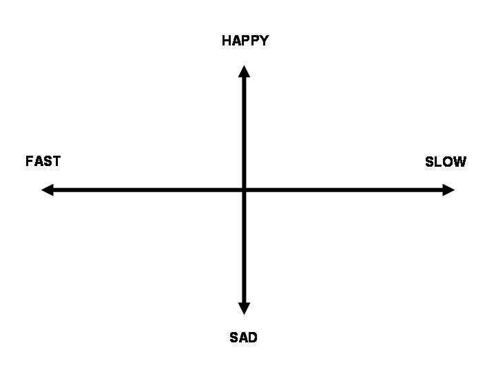
To help the readers find their way in the measureless universe of non-commercial music, Sonic Asymmetry will accompany the descriptions with two sets of dimensions – the emotive dimension and the structural dimension.
The emotional dimension is described on two axes. The vertical axis corresponds to a continuum of basic emotions – from joy to despair. The horizontal axis, squares the dimension by adding the tempo of the musical piece. The basic moods effected by the musical piece will, therefore, fall into one of the four areas.

This simple diagram will cover the most basic emotions that interact with human cognition. Keeping it as simple as practicable, the basic emotional universe would look like this:
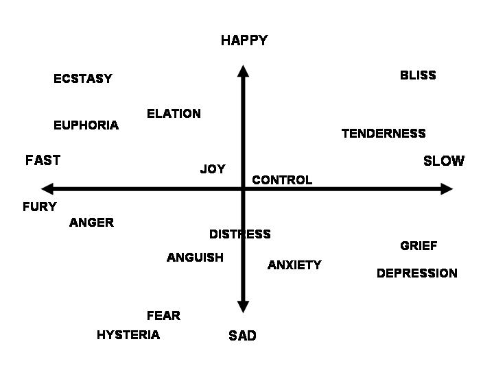
Obviously, some emotions are missing. But rarely is music capable of conveying a sense of doubt, or jealousy. On the other hand, Sonic Asymmetry will not devote much space to recordings devoid of any element of surprise, which is one of the defining denominators of the music I value highly. There is, therefore, little reason to complicate the diagram by adding this additional dimension.
What would this mean for a general impression left by, say, Captain Beefheart’s music? Here is a corresponding example.

How about Harry Partch?
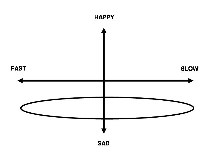
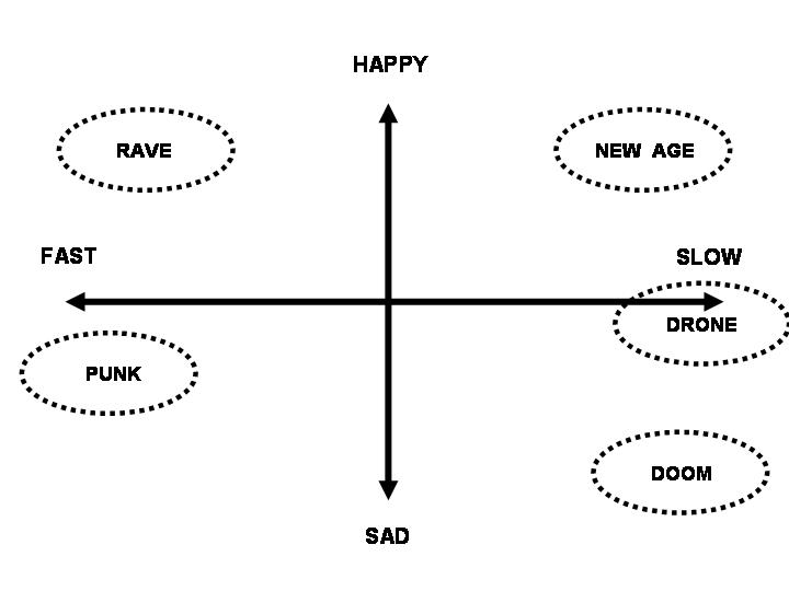
Please note that any auditory material could be represented on this diagram. Here are some examples for commercial music styles.
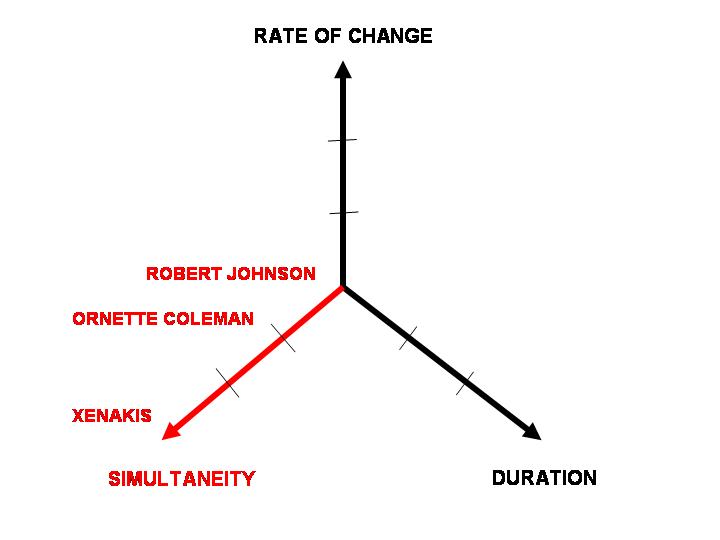
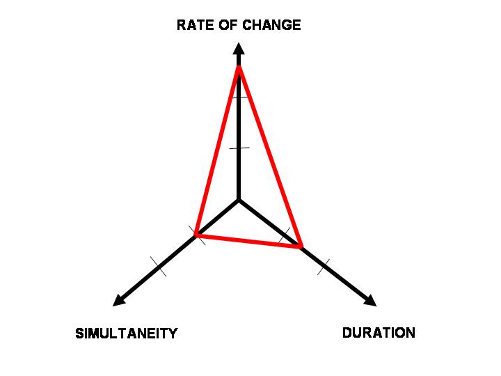
The second diagram deals with the structural elements of the musical piece. I propose three axes (a very basic spider diagram).
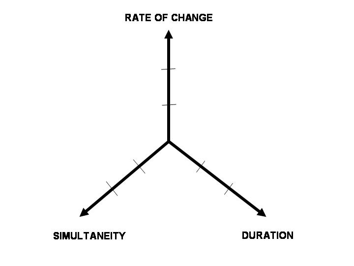
The first one denotes the objective duration of the piece. Now, this is only superficially straightforward. After all, many records sport a collection of tracks, some of which are longer than others. There is no hard science to it. I have decided that this right-hand axis would reflect the duration of the “dominant” track on a given record, which would often (although not necessarily always) correspond to the longest piece. Easily understood examples are provided below.
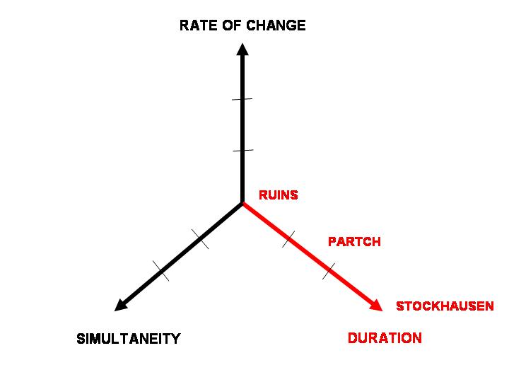
The vertical axis denotes the “rate of change”. Naturally, a composition that incorporates a variety of changing key signatures or time signatures would score high on this dimension. A sustained drone, would barely appear on the axis. The diagram below illustrates a rather extreme example of a possible range.
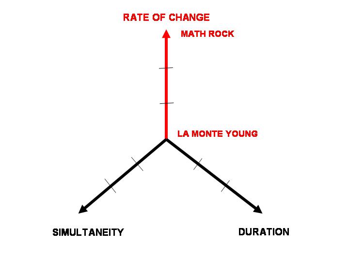
Finally, the left hand axis describes what I have named “simultaneity”. Some compositions require only one instrument, but even then, there is variety of emissions possible (e.g. an organ piece would typically be more polyphonic than human voice solo). Needless to say, musical pieces for large-scale symphony orchestras, as well as heavily-multitracked modern studio recordings score highly on this dimension.
Again, let us compare the above-mentioned structural “dimensions” in the music of Captain Beefheart and Harry Partch, respectively:

Henceforth, I will attach such diagrams with each of the presented recording, in the hope that this will facilitate, rather than muddle your appreciation of the music. If it does not, just skip them and move directly to what is of interest to you. Or better yet, listen to the music.

Are you aware that your image is being used by a blogger at livejournal? If this bothers you please contact copyright@livejournal.com and they’ll disable the entry. Hotlinking to others’ images without permission isn’t only infringement of intellectual property, it costs you bandwidth and therefore money if you’re paying for your own website.
Disgruntled and taking action,
RM
ps – I would have emailed this to you privately but didn’t see a way to do so. Sorry for the intrusion.